Most color grading examples online are a slider you drag across two JPEGs: you see that something changed and learn nothing about what or why. This page does it the other way round — one real before-and-after with the numbers, then ten styles described precisely enough to identify in the wild and rebuild yourself.
The first example uses our own footage and output; Leumos is our product, and that disclosure sits on it. We do not reproduce frames from copyrighted films.
A measured before and after
The ungraded source.
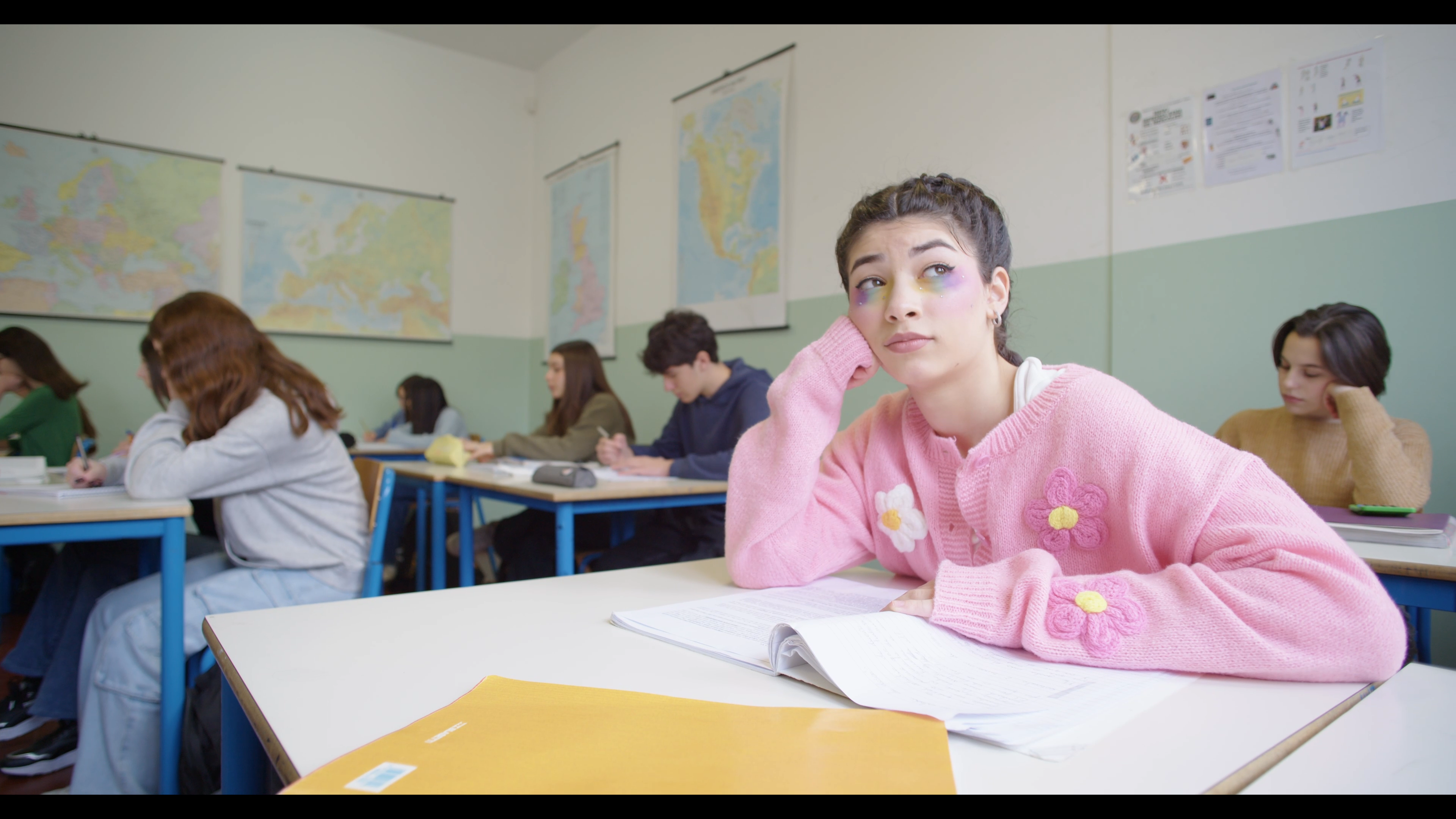
Bright, close to neutral, flat in the way corrected-but-ungraded footage usually is. Measured across the active picture area: midpoint around RGB 169/165/160 out of 255, highlights reaching 244/242/248, mean saturation 0.18, highlights fractionally blue. Nothing is wrong with it — it is a record, not a picture with a point of view.
The reference.
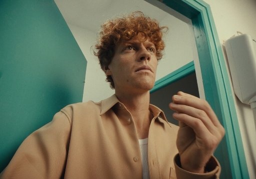
A different picture entirely, and that matters. Midpoint 111/125/104, mean saturation 0.40, highlights stopping short of white at 202/199/170. Warm skin against a cool wall, a yellow-green cast through the midtones, a low-key exposure.
The result.
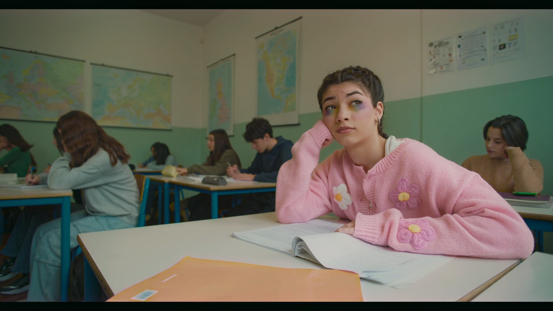
Leumos's own demo footage graded by Leumos toward that reference. Five things moved, and each is the kind of change you should be able to name in any before-and-after:
Exposure and level. The midpoint drops from 169/165/160 to 105/107/87. The classroom stops reading as a brightly lit record and starts reading as an interior. This is the single biggest change, and it is not a color change at all.
White balance and cast. The highlight ceiling falls from 244/242/248 to 205/191/188 and flips from slightly blue to warm. Wall and desks read cream rather than white — the warm-highlight character the reference has.
Contrast and rolloff. Highlights no longer reach the top of the scale: the picture has a shoulder where it had a wall.
Saturation. Mean saturation rises from 0.18 to 0.27, moving toward the reference's 0.40 without arriving there. The foreground folder shifts from yellow toward orange; the pink cardigan stays pink but sits lower and warmer.
Skin. A patch on the subject's face goes from 209/178/173 — bright and barely warm, red minus blue of 36 — to 152/113/94, red minus blue of 58. The reference's own skin measures 118/85/61, red minus blue 57. The warm separation transferred; the brightness sensibly did not, because a classroom is not the reference's darker room.
One flaw, stated. In the output, the darkest one per cent of the picture has the red channel at 0–1 while green sits near 21 and blue near 16 — a cyan-leaning shadow crush. On a delivery I would lift the black point a couple of units and check the parade. A reference match is a starting point worth grading from, not a finished grade. (Figures computed from the three published files by per-channel percentile measurement over the active picture area, excluding letterbox.)
That is what "before and after" should mean: five named, measurable moves.
Ten grading styles, and what to look for
1. Naturalistic
The hardest one, because there is nothing to point at. Neutrals genuinely neutral, skin on the fleshtone line, black point at zero without crushing, highlights rolled off rather than clipped, saturation near the camera default. Look for: a white shirt that is white in shadow and in sun. Almost all of this is correction rather than grading — see color correction vs color grading.
2. Teal and orange
Warm skin and highlights, cool shadows and backgrounds. Adobe's explanation of the mechanism is the standard one: "Orange and teal are complementary colors. In essence, they are opposites," and "Many skin tones fall into the orange spectrum, so pushing blues into the shadows will help those skin tones stand out" (adobe.com, read 12 September 2026). Look for: a vectorscope trace stretched along one diagonal, with faces at the warm end. Watch for: green foliage turning cyan and skin drifting orange where the split was applied globally. Full technique in teal and orange color grading.
3. Bleach bypass
High contrast, heavily desaturated, metallic. It is a photochemical process, not a color idea: Kodak describes skip-bleach as retaining "some or all of the image silver, which is normally removed by bleaching and fixing", and states that "the retained silver increases the contrast of the image and decreases the color saturation by adding gray or black to the dye images" (kodak.com, read 12 September 2026). Look for: blown or near-blown highlights alongside almost grey midtones — Kodak's page warns that applying it to the negative gives "lighter and possibly blown-out highlights, higher contrast and perhaps higher graininess". Watch for: faces going grey, which is the failure mode.
4. Day for night
Shooting in daylight and grading it to read as night. Wikipedia: "Day for night is a set of cinematic techniques used to simulate a night scene while filming in daylight", with the practical note that "it is typical to underexpose by about two f-stops", and the reason the convention is blue — "although moonlight is not blue, it appears bluish to the human eye due to the Purkinje effect" (en.wikipedia.org, read 12 September 2026). Look for: hard shadows in the wrong direction. Watch for: sunlit skin, which never reads as moonlight however blue you push it.
5. Monochrome
Not desaturation. A real conversion decides how each hue maps to luminance — how bright red lips become, whether a blue sky goes pale or nearly black. Look for: separation between objects that would be the same brightness with saturation simply pulled to zero. Watch for: chalky skin, from weighting the red channel too heavily.
6. Pastel and matte
Lifted blacks, reduced contrast, low saturation, often a warm or slightly green midtone cast. The dominant commercial and fashion look, and roughly where the example above lands. Look for: a waveform trace that never touches the floor. Watch for: flatness reading as an error rather than a choice — it needs one clean saturated accent to hold.
7. High-key commercial
Bright, even, clean. Highlights near the top without clipping, shadows open, saturation moderate and accurate because the product has to be the color it is in the catalogue. Look for: almost no black in the frame. Watch for: clipped whites on packaging — unrecoverable and very visible.
8. Music-video saturation
Saturation pushed hard in one or two hue families, with heavy secondary work on a specific color — a jacket, a neon sign, a wall. Look for: a vectorscope trace punching toward the boxes in one or two directions while the rest stays central. Watch for: hue clipping, where the boosted color loses its internal detail and becomes a flat shape.
9. Wedding and film-print
Warm, forgiving, slightly lifted blacks, restrained saturation, skin flattered rather than measured — usually a print-emulation curve rather than a color shift. Look for: highlights rolling softly on a white dress instead of clipping. Watch for: the warmth reaching the dress, which then reads cream instead of white.
10. Documentary and archival
Consistency across sources never meant to match: three cameras, a phone, a digitised tape. The job is agreement, not beauty. Look for: shots cutting together without a jump in black level or white balance. Watch for: a heavy look on top, which amplifies every remaining mismatch instead of hiding it. See why cameras don't match.
How to study a grade
Take any frame you admire and ask four questions in order.
Where is the black point? Open a waveform. Does the trace reach zero, stop above it, or stack flat along the floor? A lifted black point is the most common thing people mean by filmic, and the easiest to copy.
Where do the highlights stop, and in what color? If the trace stops short of the top, the look has a shoulder. If one channel stops lower than the others, the highlights carry a cast — and that cast is usually most of the look's identity.
Where is the skin? On a vectorscope. Blackmagic's documentation gives the target directly: keep "warm color saturation along a line at approximately 10 o'clock on the vectorscope. This is known as the 'fleshtone line' and is based on the color of blood beneath the skin's surface", and it "is applicable to all skin pigmentations" (Blackmagic SmartScope manual, read 12 September 2026). How far the grade moved faces off that line tells you how aggressive it is.
How wide is the palette? Where does the vectorscope trace concentrate? Two directions is a designed look; every direction equally is either naturalistic or nothing.
Do this on ten frames you like and you will have a better vocabulary than any preset pack provides. If your own grade keeps failing these checks, why does my grade look off works through six causes in order.
Rebuilding a look from an example
Copying a look you found has a real limit: much of what you admire is not the grade. Film stock, the print chain, the lens, the lighting and the production design did a large part, which is why chasing an exact match with curves ends badly. How to recreate a movie look from a still splits a reference into the copyable part and the rest; cinematic color grading covers how looks are assembled.
The order that works: normalise, correct, build contrast, then apply the palette. Applying the palette to uncorrected footage is why most attempts fail — the sequence is in how to color grade video.
Leumos is ours, so read this as disclosure: it matches one selected shot at a time to a still reference in the browser, shows the result in motion, and has a Skin tone control with an inspectable mask plus waveform and vectorscope (leumos.ai/llms.txt, read 12 September 2026). Automatic reference matching of a full timeline is not available in this release. Plans: pricing. Free routes: free color grading software.
FAQ
What is a good example of color grading?
A useful one is any pair where you can name what changed: exposure, white balance, contrast, palette and skin. If a before-and-after cannot be described in those five terms, it is a filter rather than a grade.
What is the difference between a before and after and a good grade?
A visible difference is easy; a defensible one is not. A good grade holds the black point where intended, keeps highlights off the ceiling, keeps faces near the fleshtone line, and stays consistent across every shot in the scene — not just the one in the comparison.
What are the main color grading styles?
Naturalistic, teal and orange, bleach bypass, day for night, monochrome, pastel and matte, high-key commercial, saturated music-video, warm print-emulation and consistency-first documentary. Each is defined by a contrast shape and a palette width, not by a preset name.
How do I copy a color grade from a photo or a film still?
Match tone before color: get the black point, the exposure and the highlight rolloff close first, then the palette, then check skin. Accept that the lens, the lighting and the film stock are not copyable — that split is the subject of recreating a movie look from a still.
Why does my before and after look worse than the examples online?
Usually because the example was shot for the look and yours was not, or the look went on before the footage was corrected. Published comparisons also use flattering source frames; a grade that works on one frame of a scene is not yet a grade.
Can AI produce these grades automatically?
Automatic tools are good at correction and at transferring a reference's statistics — the measured example above is exactly that. They are not good at choosing the reference, at mixed lighting, or at deciding how far to push skin. See AI color grading for filmmakers.
Sources
| Source | Used for | Read |
|---|---|---|
| Adobe, orange and teal color grading | Complementary mechanism | 12 Sep 2026 |
| Kodak, Film Processing Techniques | Skip-bleach effects | 12 Sep 2026 |
| Wikipedia, Day for night | Definition, underexposure, Purkinje | 12 Sep 2026 |
| Blackmagic SmartScope manual | Fleshtone line position | 12 Sep 2026 |
| leumos.ai/llms.txt | Leumos capabilities | 12 Sep 2026 |
Image measurements were computed by us from the three published Leumos demo files.
Related reading
- Cinematic color grading — how these looks are built, block by block
- Teal and orange color grading — the most copied example, in depth
- How to color grade video — the seven-step workflow
- How to recreate a movie look from a still — copying one reference frame
- Color correction vs color grading — which pass an example belongs to
- AI color grading for filmmakers — what automation can and cannot do
- Film emulation in color grading — the curve, halation and grain behind a film look
Read the scopes: how to read a vectorscope and how to read a waveform monitor explain the readouts used above.