Cinematic color grading is the deliberate shaping of contrast and palette after the shoot: a tonal curve that rolls off at both ends instead of running straight, saturation held back rather than pushed, skin kept on its own vector, a narrow and usually complementary palette, and the texture of a film print — grain and halation — added last. It is an order of operations, not a filter.
Most disappointing attempts fail on the order, not the tools: people reach for the palette first — teal, amber, crushed blacks — on footage never normalised or corrected. For the narrower job of copying one film still, see how to recreate a movie look from a still.
What "cinematic" actually means in color terms
Strip the marketing and five measurable things are left.
A shaped tonal curve. Video in a display-ready profile runs close to straight through the midtones and then clips. A film-derived curve compresses at both ends: highlights roll into white over several stops instead of hitting a wall, shadows lift slightly off absolute black. Bright windows keep detail; black areas read as dark rather than as holes.
Restrained saturation. Almost every look people call cinematic is less saturated than the camera default, with what remains concentrated in one or two hue families. Wide, even, everything-is-vivid color reads as television.
Protected skin. Faces sit in a narrow band of hue that audiences read unforgivingly. A look goes around skin, not through it.
A narrow palette. Two or three hue families, usually with some complementary tension. Wikipedia dates the dominant version precisely: "From 2010, many films, such as Hot Tub Time Machine and Iron Man 2, began using the complementary colors orange and teal" (en.wikipedia.org, read 12 September 2026).
Texture. Grain, a little halation around highlights, softened resolution — properties of a photochemical chain, added deliberately at the end on digital footage.
Only two of the five are about color in the everyday sense. Most of the distance between camera output and a film look is tonal.
The building blocks, in the order they stack
Each block assumes the one before it is done. Skipping forward is the commonest cause of an unrescuable grade.
1. Normalise. Tell the software what the file is. Log, raw and baked-in profiles need different starting transforms, and the wrong one means every later decision is made on a wrong picture. This is where an S-Log3 or V-Log clip stops being a grey slab and becomes a photographic image. It is not a look. Our log format reference computes where each format puts its code values.
2. Correct. Exposure and white balance, per shot, until the scene agrees with itself: black point where you want it, a face at a sensible level, neutrals actually neutral. A balanced scene takes almost any look; an unbalanced one makes any look cheap. Where this pass ends and the creative one begins is color correction vs color grading.
3. The tonal curve. Build contrast with a curve, not a contrast slider. A slider pivots around the midpoint and drags saturation with it; a curve lets you place the toe, the shoulder and the straight section separately. Lift the black point a few units off zero so shadows have air, put the shoulder so your brightest important highlight lands short of clipping, and leave a long straight run through the faces. Blackmagic describes curves as letting you "create smooth cinematic contrast adjustments" (blackmagicdesign.com, read 12 September 2026). Most film-print emulations do exactly this before touching hue.
4. The palette. Only now does the look go on — the four below cover most of it.
5. Skin. Whatever the palette did, faces get checked and usually pulled back. A hue qualifier or a skin control isolates them, so warmth in the picture does not turn faces orange and cyan in the shadows does not turn the shaded side of a face grey. Check on a vectorscope, not by eye: Blackmagic's scope documentation puts the target at "a line at approximately 10 o'clock on the vectorscope. This is known as the 'fleshtone line' and is based on the color of blood beneath the skin's surface", and notes it "is applicable to all skin pigmentations" (Blackmagic SmartScope manual, read 12 September 2026).
6. Texture, last. Grain and halation over the finished look, at delivery resolution. Halation is a physical artefact, not a style: light passes through the emulsion, bounces off the back of the base and returns. Film fights it with a layer that exists to "absorb light that passes through the emulsion, thus preventing any light from being reflected back through the emulsion from the rear surface of the base" (en.wikipedia.org, read 12 September 2026). What you see in a film frame is what that layer did not catch. A little reads as photography; a lot reads as a plugin.
The four palettes
Teal and orange. Warm skin and highlights against cool shadows. Adobe is blunt about the mechanism: "Orange and teal are complementary colors. In essence, they are opposites. They look good together and contrast well," and "Many skin tones fall into the orange spectrum, so pushing blues into the shadows will help those skin tones stand out" (adobe.com, read 12 September 2026). The full technique, including where it breaks, is in teal and orange color grading.
Bleach bypass. High contrast, heavily desaturated, silver-looking — a real photochemical process rather than a color idea. Kodak describes skip-bleach processing as retaining "some or all of the image silver, which is normally removed by bleaching and fixing", with the consequence that "the retained silver increases the contrast of the image and decreases the color saturation by adding gray or black to the dye images" (kodak.com, read 12 September 2026). Emulating it means that pairing — contrast up, saturation down — and accepting the highlight loss Kodak also warns about.
Monochrome. Not a saturation slider at zero. A real black-and-white conversion decides how each hue maps to luminance: how bright red lips become, whether a blue sky goes pale or near-black. Channel weighting rather than desaturation is the whole difference.
Pastel and matte. Lifted blacks, reduced contrast, low saturation, often a warm or green cast through the midtones. It dominates commercial and fashion work as teal and orange no longer does.
Why a LUT alone does not make it cinematic
A 3D LUT is a lookup table: for a given input color, output this color. It carries no knowledge of what your footage is, how it was exposed, or where the faces are.
So a LUT on un-normalised footage produces nonsense; on badly exposed footage it produces a consistent version of the exposure problem; across a scene whose shots do not match, it makes the mismatch more visible. LUTs earn their place in two spots: as a normalising transform at step one, and as a palette at step four on already-corrected footage. The same caution applies to anything sold as a one-click film stock — the stock is only part of what you see in a film frame, the argument recreating a movie look from a still works through.
Where the famous looks came from
Two pieces of history explain most of what filmmakers are copying.
Digital grading arrived around 2000 and changed what was affordable: Wikipedia records O Brother, Where Art Thou? as "the first film to be wholly digitally graded" in Hollywood, and notes that since 2010 "almost all feature films have gone through the DI process" (en.wikipedia.org, read 12 September 2026). Looks that had needed a lab became a decision in a suite.
The complementary-palette trend was named and argued about at the time. Todd Miro's 2010 essay is usually credited with naming it, and his explanation is the one every tutorial still repeats: "flesh tones exist mostly in the orange range and when you look to the opposite end of the color wheel from that, where does one land? Why looky here, we have our old friend Mr. Teal" (Todd Miro, "Teal and Orange – Hollywood, Please Stop the Madness", Into The Abyss, 14 March 2010, theabyssgazes.blogspot.com, read 12 September 2026). It is a complaint, not a recommendation.
We describe named film grades in words rather than reproducing frames, which are copyrighted.
A worked example: grading toward a reference
The three frames below are Leumos's own demo footage and our own output. Leumos is our product, so read this as an illustration, not a review.
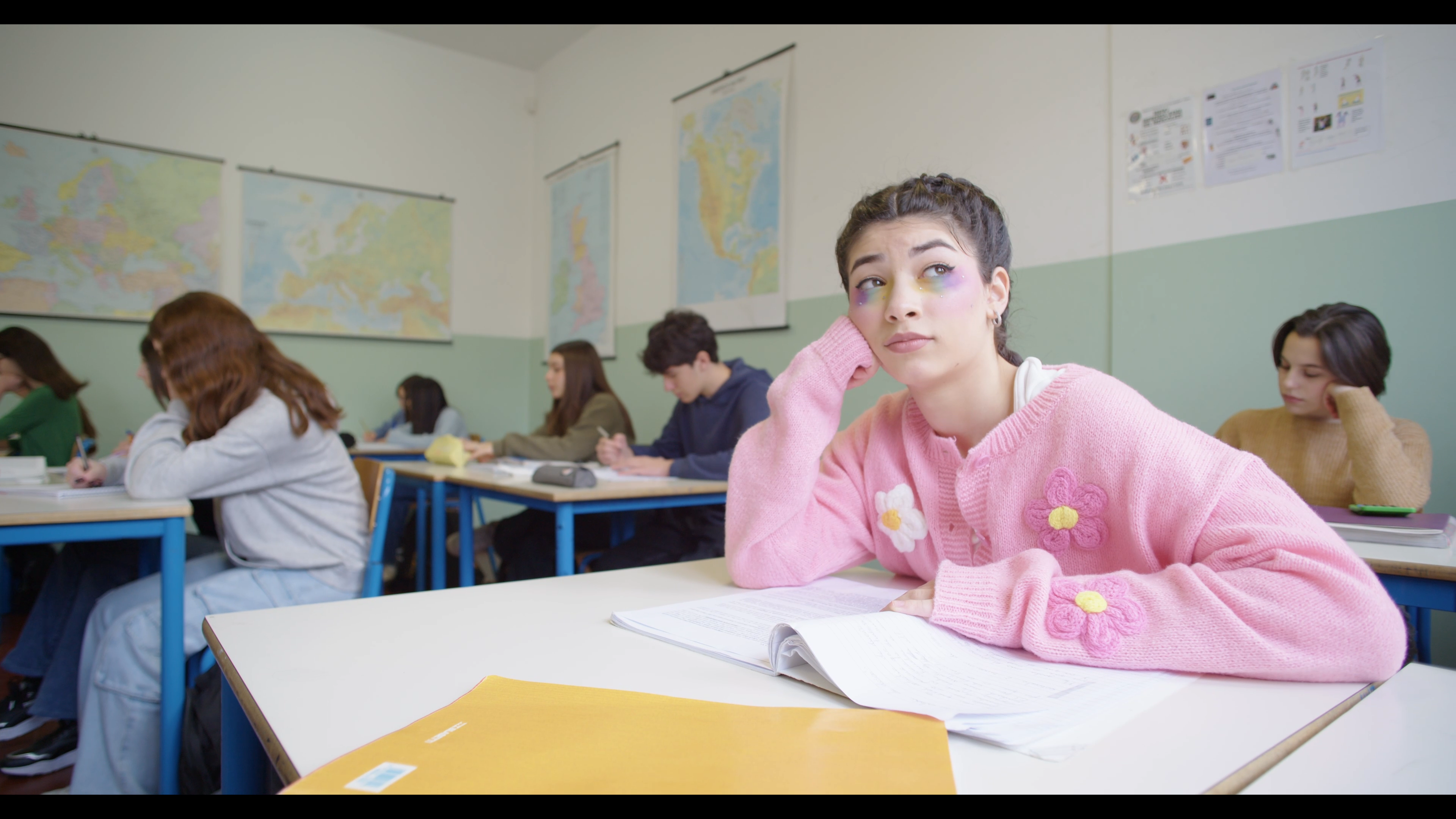
The source is bright and close to neutral, flat in the way corrected-but-ungraded footage usually is. Measured over the active picture area, its midpoint sits near RGB 169/165/160 out of 255, highlights reach 244/242/248, and mean saturation is 0.18.
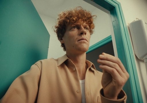
The reference is a different picture entirely: darker, far more saturated (mean 0.40), with a yellow-green cast through the midtones and highlights stopping short of white at 202/199/170. Warm skin against a cool wall — a complementary palette, and a low-key one.
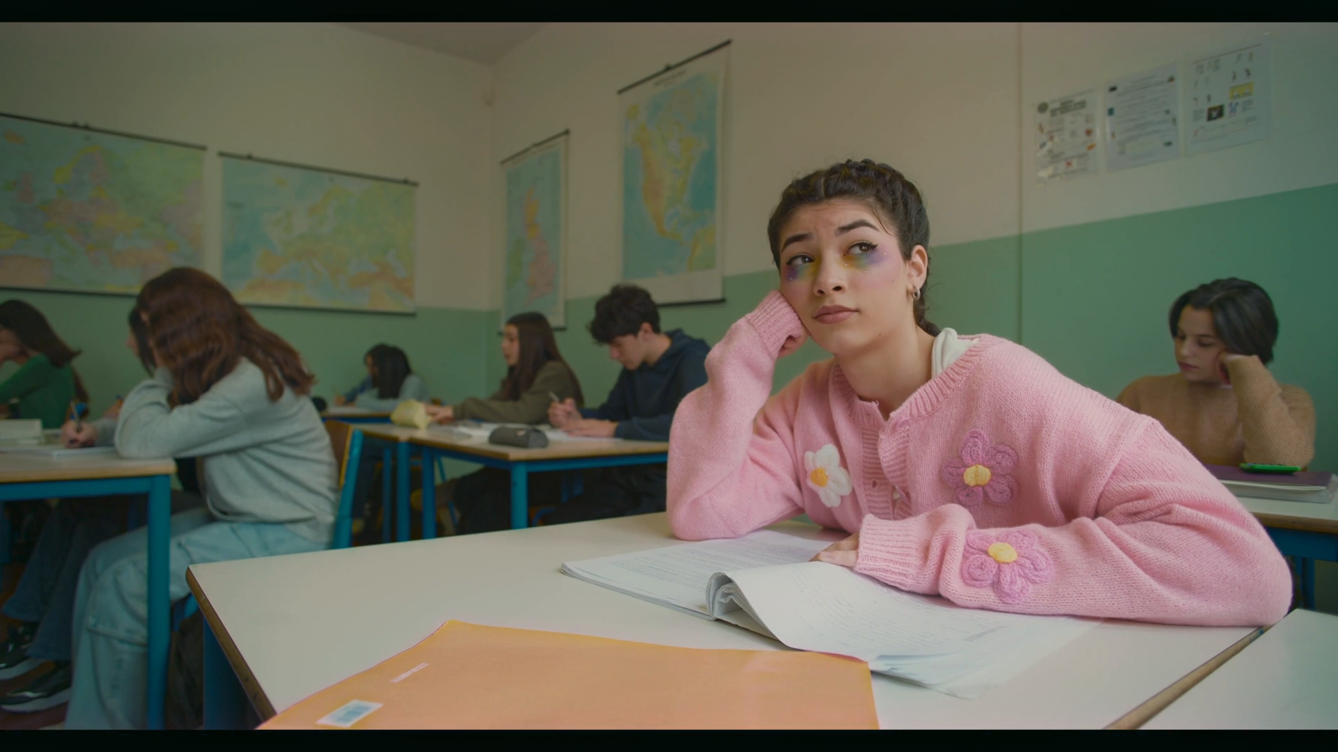
The output keeps the content and takes the reference's character:
- Level. The midpoint drops from 169/165/160 to 105/107/87 — close to the reference's 111/125/104. It now reads as an interior.
- Highlight rolloff. The ceiling comes down from 244/242/248 to 205/191/188, and the cast flips from slightly blue to warm. Wall and desks read cream rather than white.
- Saturation. Mean saturation rises from 0.18 to 0.27, toward the reference's 0.40 without reaching it.
- Skin. A patch on the subject's face goes from 209/178/173 (red minus blue 36) to 152/113/94 (red minus blue 58). The reference's own skin patch measures 118/85/61, red minus blue 57. The warm separation matches; the level does not, and should not, because the classroom is not the reference's room.
One honest flaw, the kind you only find by looking: in the output the deepest one per cent of the picture has the red channel at 0–1 while green sits near 21 and blue near 16 — a cyan-leaning shadow crush. On a delivery I would lift the black point a couple of units and check the parade first. A reference match gets you a starting point worth grading from; it does not end the conversation. (Figures computed from the three published files by per-channel percentile measurement over the active picture area, excluding letterbox.)
How to tell whether it worked
Three checks. Waveform: is the black point where you meant it, and is the trace stacking flat against floor or ceiling? Parade: has a channel clipped unnoticed, the fault in our example above? Vectorscope: are faces near the fleshtone line, and is the trace concentrated in the hues you chose?
The full workflow is how to color grade video; a look that feels wrong without being wrong anywhere you can point at is why does my grade look off.
Doing this in a browser
Leumos is ours, so treat this as disclosure rather than a recommendation. It is a browser color studio: import footage, it detects cuts, you select a shot and match it to a still reference, review in motion, then adjust with creative controls, an AI Color Correction pass, a Smart Grade shortlist, and a Skin tone control that selects skin, lets you inspect and refine the mask, then adjusts hue, warmth, color boost, brightness and contrast (leumos.ai/llms.txt, read 12 September 2026). Waveform and vectorscope are built in.
The limits that matter: matching runs on one selected shot at a time and is reviewed — automatic reference matching of a full timeline is not available in this release — and it returns rendered graded video, not grade data, LUTs, XML, AAF or CDL, so a conform still happens in your editor. Plans: pricing. Free routes: free color grading software.
Frequently asked questions
What makes a color grade look cinematic?
A tonal curve that rolls off at both ends instead of clipping, saturation held below the camera default and concentrated in two or three hue families, skin protected on its own vector, a little film texture at the end. Tonal work does more of it than color work.
Is cinematic color grading just teal and orange?
No. It is one palette among several, and a dated one — already being complained about in 2010. Bleach bypass, monochrome and low-contrast pastel looks are equally cinematic, on the same tonal foundation.
Why does my footage look flat instead of cinematic?
Usually one of three: no input transform, so log footage is graded as if it were Rec.709; contrast built with a slider rather than a curve; or the look applied before the shots were corrected to agree. Fix in that order.
Can a LUT give me a cinematic look on its own?
No. A LUT is a fixed input-to-output mapping with no knowledge of your exposure, white balance or where the faces are. It works as a normalising transform at the start, or as a palette on already-corrected footage — not as a replacement for the middle.
Should I add grain and halation?
Add them last, at delivery resolution, and less than you think. Halation is light bouncing off the back of the film base, so a little around bright edges reads as photography. Grain applied before the look gets crushed or amplified by the contrast on top.
Do I need DaVinci Resolve to grade cinematically?
No. Every block here — transform, primaries, curves, a hue qualifier for skin, scopes — exists in Resolve's free version, Premiere's Lumetri panel, Final Cut and browser tools. Order matters more than application.
Sources
| Source | Used for | Read |
|---|---|---|
| Wikipedia, Color grading | DI history; orange-and-teal | 12 Sep 2026 |
| Todd Miro, Into The Abyss, 14 Mar 2010 | Naming of the trend | 12 Sep 2026 |
| Adobe, orange and teal color grading | Complementary mechanism | 12 Sep 2026 |
| Kodak, Film Processing Techniques | Skip-bleach effects | 12 Sep 2026 |
| Blackmagic Design, Resolve color page | Curves, scopes | 12 Sep 2026 |
| Blackmagic SmartScope manual | Fleshtone line position | 12 Sep 2026 |
| Wikipedia, Anti-halation backing | Halation | 12 Sep 2026 |
| leumos.ai/llms.txt | Leumos capabilities | 12 Sep 2026 |
Related reading
- AI color grading for filmmakers — what automation covers
- Color grading examples — these blocks as before-and-after
- Teal and orange color grading — one palette in depth
- How to recreate a movie look from a still — one reference frame
- How to color grade video — the seven-step workflow
- Color correction vs color grading — where block two ends
- Why does my grade look off — six causes
- Film emulation in color grading — what block six is copying
- Color timing in film — how the lab did blocks one and two
Related: how to read a vectorscope for the skin line, log footage explained for the normalise step.