A vectorscope is a video scope that plots the color in your frame on a circle: the angle around the circle is hue, and the distance from the centre is saturation. It carries no brightness information at all. Colorists use it to judge white balance, place skin tone, and check that two shots agree on color.
That last point is what makes it worth learning. Your eyes adapt to a cast within seconds of looking at a picture; a vectorscope does not.
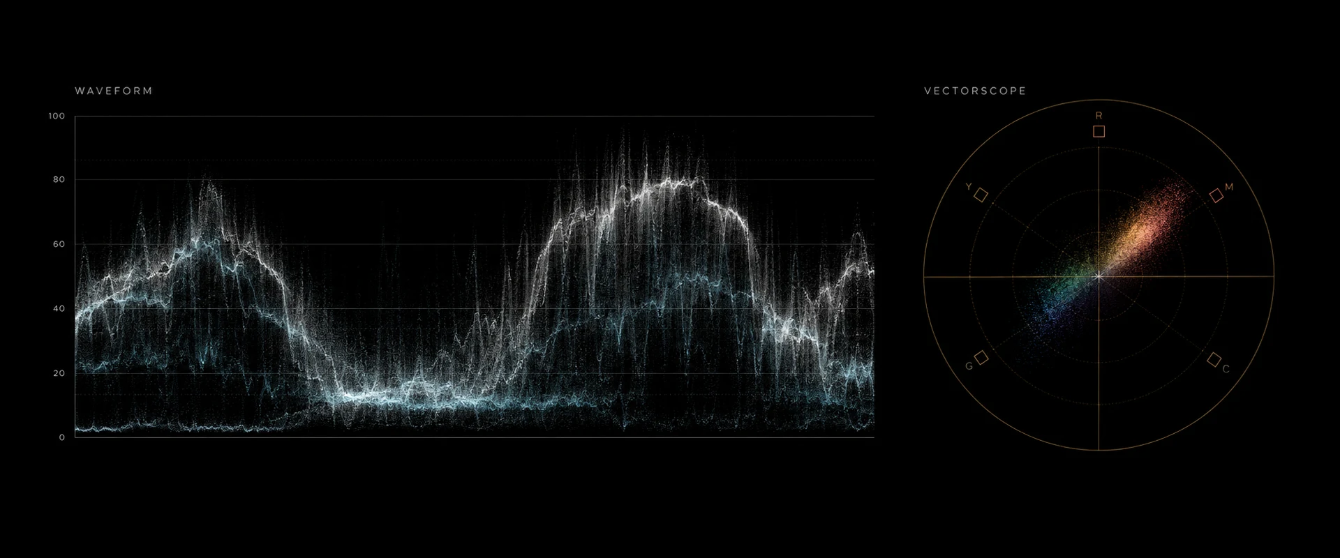
An illustration of a waveform and a vectorscope, not a screenshot of graded footage. The waveform reads exposure and contrast; the vectorscope reads color balance and saturation.
What the graticule shows
The overlay printed on the vectorscope — the graticule — is the part that turns a blob of pixels into a measurement.
Six color targets. Small boxes sit around the circle at the angles of the three primaries and three secondaries. Apple's Final Cut Pro documentation describes the layout exactly: "The angle around the scale represents the hue displayed, with targets indicating the primary colors of red, green, and blue and the secondary colors of yellow, cyan, and magenta" (Apple, read 12 September 2026). Feed the scope a standard color-bar test signal and each bar should land in its box; that is what the boxes are for.
Saturation as distance. Apple again: "The distance from the center of the scale to the outer ring represents the saturation of the color being displayed. The center of the scale represents zero saturation, and the outer ring represents maximum saturation." A frame with a tight cluster at the centre is nearly monochrome. A trace pressing against the outer ring is at the limit of what the format can carry.
Hue as angle. Two shots with the same color at different intensities sit along the same radius. Two shots with genuinely different color sit at different angles. That distinction — angle versus distance — is the one to internalise, because it separates "too much" from "the wrong one".
The skin-tone line. A diagonal line runs from the centre out between the yellow and red targets. Apple calls it the line "that represents the human skin tone chroma phase, which is between the yellow and red color bar targets". It is not a beauty standard: the chroma phase of human skin is remarkably consistent across every skin tone, and what changes between people is mostly luminance and saturation, which are distance and brightness rather than angle. Some tools label it the I-line, after the I axis of the older NTSC color system it derives from.
Using it for white balance
This is the job the vectorscope does better than your eyes.
Find a part of the frame that should be neutral — a white wall, a grey card, concrete, a shirt you know is white. On a correctly balanced shot, the pixels from that area sit at or very near the centre of the circle. If the whole trace, or that region of it, is pushed off-centre toward blue, the shot is cool; pushed toward orange-yellow, it is warm. The direction of the offset tells you which way to correct, and the magnitude tells you roughly how far.
The failure mode to know: a frame genuinely dominated by one color — a red neon sign, a green field filling the frame — will push the trace off-centre for real reasons. The vectorscope measures the picture, not the lighting. Judge the offset from areas you know should be neutral, not from the whole blob.
Using it for skin tone
Put a face on screen and look at where the skin pixels fall relative to the skin-tone line.
Skin that sits along the line, at whatever distance, reads as natural. Skin rotated off the line toward red reads sunburnt or angry; rotated toward yellow reads jaundiced or sickly. That rotation is almost always a white balance problem rather than a skin problem, and correcting the balance usually puts skin back on the line without touching skin directly.
Distance from the centre along the line is saturation, and that one is a taste decision. Skin further out is more vivid; skin closer in is more muted. Neither is wrong, but it must be consistent from shot to shot in a scene, and a vectorscope is the only way to check that without your eyes lying to you.
Matching two shots
The vectorscope's most practical use in an edit. Park on a frame from shot A, note the shape and position of the trace. Cut to shot B and compare. You are looking at three things:
- Centre of mass. Is the whole cloud shifted in one direction on one of them? That is a white balance difference.
- Overall spread. Is one trace consistently further from centre? That is a saturation difference.
- Skin position. Do faces sit at the same angle, at a similar distance, on both?
Two shots whose traces agree on those three will cut together even if one was shot on a different camera. This is exactly the check that makes an automatic match trustworthy or not: when a reference match produces a result, the vectorscope tells you whether the color actually landed or whether you just got used to it — the same check applies to every tool surveyed in AI color grading explained. The wider workflow is in how to color grade video, and the line between fixing color and styling it is in color correction vs color grading.
One caveat for flat sources: read the vectorscope after normalisation, not before. An un-normalised log clip produces a small, desaturated trace clustered near the centre that says almost nothing about the scene, because the log curve has taken the saturation out on purpose — see log footage explained.
Checking a look
Once you are building a look rather than correcting, the vectorscope tells you what the look is actually doing. A teal-and-orange grade shows up as the trace stretching along one diagonal and thinning along the other. A bleach-bypass look pulls everything toward the centre. A heavily pushed grade shows up as a trace flattening against the outer ring, which is where color clips and hue starts shifting in ways you did not ask for.
The outer boxes are also a delivery check. Broadcast specifications limit how far color may go; if your trace is punching past the targets, a QC department may bounce the file.
What a vectorscope cannot tell you
Brightness. Nothing on a vectorscope reports exposure. Two shots can produce identical vectorscope traces and be a stop and a half apart, because a vectorscope discards luminance by construction. Exposure is a waveform's job — see how to read a waveform monitor.
Where in the frame. The trace has no spatial dimension. A vectorscope cannot tell you that the cast is only in the background, or that only the face is oversaturated. A waveform at least maps left-to-right position; a vectorscope maps nothing.
Whether the look is right. It measures; it does not judge. A technically neutral shot can be the wrong choice for the scene.
Differences between tools
Every color application has a vectorscope and they do not all show the same thing.
DaVinci Resolve. Blackmagic describes its scope as one that "displays a circular graph of your image data that represents its hue and saturation levels" (Blackmagic Design, read 12 September 2026). Resolve offers a 2x zoom mode that magnifies the area near the centre, which is where most real footage lives — useful, and a trap if you forget it is on and compare a zoomed trace against an unzoomed one.
Final Cut Pro. Apple's implementation lets you show or hide the skin-tone line explicitly, and offers a magnification setting alongside it (Apple, read 12 September 2026).
Adobe Premiere Pro. Lumetri ships two separate vectorscopes, YUV and HLS, which are different plots of the same data rather than alternative skins. Adobe's own description of the panel is "hardware-accelerated Lumetri scopes like Vectorscope, Histogram, Parade, and Waveform" (Adobe, read 12 September 2026). Adobe's detailed help pages refused our automated request on 12 September 2026, so this cites the product page rather than quoting documentation we could not retrieve.
The practical consequence: a saturation reading is comparable within one tool and not necessarily across two. Compare shots in the same scope, in the same mode, at the same zoom.
In Leumos
Leumos is our own product, a browser color grading studio, and it includes both scopes. Its documentation describes them as displays that let you "inspect exposure, color balance, and saturation with built-in waveform and vectorscope displays" (leumos.ai/llms.txt, read 12 September 2026).
The reason they matter there is the same reason they matter anywhere: Leumos matches one selected shot to a still-image reference, and a match is a claim about color that you should verify rather than accept. The vectorscope is where you check that skin has stayed on the line and that the reference's cast has not come across with its content. There is also a dedicated skin tone control that selects skin automatically and lets you refine the mask before adjusting hue and warmth — which the vectorscope is the right instrument for judging. Plan details are on the pricing section.
FAQ
What does a vectorscope measure?
Hue and saturation, and nothing else. The angle around the circle is hue; the distance from the centre is saturation. Brightness is discarded entirely, which is why a vectorscope is always used alongside a waveform rather than instead of one.
What is the skin tone line on a vectorscope?
A diagonal line running from the centre out between the yellow and red targets, marking the chroma phase of human skin. Apple describes it as "the human skin tone chroma phase, which is between the yellow and red color bar targets". Faces from any skin tone should sit along it; what varies between people is distance, not angle.
How do I fix white balance with a vectorscope?
Find an area that should be neutral and see which way its pixels sit off centre. Toward blue means the shot is cool; toward orange means warm. Correct temperature and tint until that region collapses toward the centre, then confirm skin has landed back on the skin-tone line.
Why is my vectorscope trace off centre?
Either the shot has a color cast, or it genuinely contains a dominant color — a neon sign, a green field, a red wall. Judge from areas you know should be neutral rather than from the whole trace, otherwise you will correct away the thing you wanted.
Vectorscope or waveform — which should I use?
Both, for different questions. The waveform answers exposure and contrast; the vectorscope answers color balance and saturation. Neither can answer the other's question. The standard order is to set exposure on the waveform first, then balance color on the vectorscope.
Does the vectorscope show if color is clipping?
Partly. A trace pressed hard against the outer ring means saturation is at the limit of the format, which is where hue starts shifting unpredictably. For channel clipping specifically — one of red, green or blue hitting its ceiling — an RGB parade on the waveform is the clearer read.
See the scope in use: color grading examples reads a real before/after on the scopes, and cinematic color grading shows where the skin line matters most.